Hosting Companies – Don’t Lose Your Website!

We get calls and inquiries from customers almost on a daily basis.  Many of them are looking for an affordable website design.  Others are just looking for logo design – and some just for website hosting.

The reasons are many that people are looking to have a more stable design business work for them.  Whether it be due to a previous designer no completing their site, a previous designer being extremely slow and not completing the work in a timely basis, or someone needing to have maintenance done to their website and the previous designer is no where to be found.  These are all good reasons to choose an actual business rather than a person that advertises for website services.  Not only is it usually under-the-table money, but they could be here one day and gone the next.

But the larger problem we often hear about – is someone’s website being completely lost.  Gone.  What happened?  Well, they forgot to renew their website hosting account.  When it comes to website hosting, it is important that you choose a business that is also thinking ahead for these specific moments.

Most of the larger website hosting companies that charge very little for website hosting have a myriad of problems – whether they are not as reliable or they load thousands of customers on the same server which makes your website load extremely slow.  But more imporantly – are website backups.

BsnTech does require our users to set backups – or even do manual backups of their website.  It is done automatically.  We keep a rolling seven-day backup of both your website AND any e-mail accounts that you may have.  We cannot tell you how many times this has saved our customers.  Whether they deleted an e-mail that they didn’t mean to delete – or they made a change on their website that brought their website down.

In the event that our customers discontinue website hosting services – or forget to pay their invoice in a timely manner, we don’t go to the extreme of immediately closing out your hosting account and deleting all of your files that make up your website in addition to your e-mail accounts.

While the website may be suspended after non-payment, the website and the hosting account still exists – and will for up to an additional month.  That way if a customer simply forgot to pay the invoice, then they can submit payment within that month window and get the website turned back on quickly.

What is even better – is if the month period fully lapses, the website still is not permantently deleted on our hosting servers.  Our systems will automatically create a full website backup and then close out the account.

Many customers have taken advantage of this as well.  They may have a seasonal business and don’t need website hosting for the full year.  So they may have their site up for six months – then have it down for six months.  When they are ready to have it restored, we simply obtain the payment for the web hosting services from them – and we’ll go in and restore the website just like nothing happened.

So, be careful when you choose a web hosting company.  Many of them have very stringent and not-so-forgiving policies that could leave you without your website.  Especially like a person that just called us a few days ago – they paid thousands for their website – to have it be completely deleted – with no backup – because the credit card on their hosting account had expired and their site was deleted.

Making Semi-Transparent Effects on Web Pages

I’ve been using semi-transparent effects on many websites that I’ve been creating for users.

For example, there is usually a main content area that has a white background.  However, the customer has specifically requested that they want to have a background image on their website that can also be seen through the white area of the content.

This is also called website opacity, graphic opacity, graphic transparency, or website transparency – amongst many other ways that it is called.

In order to get the transparent objects to work on a website, there are only a few stylesheet / CSS modifications that are needed:

opacity: 0.9;
filter:alpha(opacity=90);

So for example, take this image – which is used on my website as a graphic:


So in the above, I created a DIV and manually set the parameters so it would be 191 pixels wide by 61 pixels tall with a background image applied. There isn’t any opacity applied to the above.

Now, below, we will set an opacity value of 0.5 – which means it will be 50% transparent and 50% opaque:


Pretty neat eh? This can be done with any section of a website.  In essence, the opacity filter on a website will take a graphic – or even a standard color (will show that momentarily) – and make it so it has a level of transparency to it.

Here is an example of a purely black hex color (#000000) and it looks like a shade of gray.  That is because the background of this site is white – so when you put together a black color that is semi-opaque with the white background, it combines to make a gray color.  The opacity value in this example is set to 75% (0.75) – so it is 75% opaque and 25% transparent:


Alright, let’s do one more example that may be more of a hands-on task.  In general when I do website design, I will create a “body” section in a CSS file.  Let’s set the CSS to this:

body {
        margin: 0px 0px 0px 0px;
        background-image: url(‘http://www.bsntech.com/wp-content/uploads/2015/03/bsn_logo.png’) repeat-x;
}

This will set the overall background for the website (in this case – the background of this website you are viewing now with the blue).

Then, another piece of CSS code will actually make the content area of the website itself – which in the case of this page, the white area you are viewing now:

content {
        margin: 0px auto;
        width: 700px;
        opacity:0.5;
        filter:alpha(opacity=50);
        background: #ffffff;
}

In the “content” section of the CSS file, it says that the content area will be 700 pixels wide and it will be centered on the page (hence the margin 0px auto – as described in a previous post).  It also says the background will be all white – BUT it will have an opacity of 50%.  This will allow some of the background-image indicated in the “body” section above to bleed through over the top.  While the below example doesn’t show the full-size 700 pixel width, this will give you a general idea:


This is the content area of the site. Notice the “bleeding through” of the background image over the top of this white section. Opacity is set to 50%.


This is the content area of the site. Notice the “bleeding through” of the background image over the top of this white section. Opacity is set to 75%.


This is the content area of the site. Notice the “bleeding through” of the background image over the top of this white section. Opacity is set to 25%.


So in the above example, that shows you hands-on uses for using transparent or opaque objects in websites. The above gives you the full example of having a background image applied – and then having a certain opacity set to the content area of the site where the text might be. The various shades of opacity used above include 50%, 75%, and then 25% – so you can see the difference.

As discussed, you can use the opacity or transparent filter on any object on the website.  If you want to make a background image be a little lighter than the original graphic, apply the transparent effect.  If you want a content area to have a background image overlay like in the above, it can be done.  If you simply want to change a shade of a color (like the black color above), you can use opacity to change the hue.

There certainly are many uses for allowing you to make use of these transparent stylesheet properties – and add an extra design dimension to your site!

Having the Same Look & Feel to a Website

Having the same look and feel to every page on a website is a requirement in today’s website design world.  Many years ago, website design was done using programs like FrontPage or even Notepad to type in the coding in there.  Now, FrontPage is a thing of the past and Notepad is too tedious.  Not to mention – these programs do not allow for dynamic websites that can be changed on the fly or even be updated by the customer that requested the website to be made.

Enter CSS – or Cascading Style Sheets.

Cascading Style Sheets help to provide a website the look and feel that customers want.  In a CSS file, you put everything that you want to have in the way of the look a feel of a website; the colors, where a header image should be, the width of any side “panels”, the width of the entire page, whether tables, text, or the entire site is centered, amongst thousands of other possibilities.

CSS style sheets took web design to the next level with the functionality and features.  Of course, it is not necessary to have a CSS file – because you can also put the CSS style information directly into the HTML of the page that you are working with.  But, that means this would have to be done on every single page of the site – making the page load time longer.  That is why you use one CSS file and then call it in the <head> section of the website like this:

<link rel=”stylesheet” href=”PATH-TO-CSS-FILE” type=”text/css” />

Of course, you can also have more than one CSS file on the page.  If there are a few pages that need to have additional styles added, you can put them in a different CSS file.  Although it is best to have them all in one CSS file to prevent so many files needing downloaded from your web server to render the page.  You could have hundreds of CSS entries in a file – but only one of them is used on a site.  Of course, this isn’t ideal because you are downloading a large file that slows down the website.  Therefore, when you create a CSS file, ensure you only put entries in the file that you are actually using – at least somewhere on one of the pages of the website.

Making a Background Image Static or Stick

Many web designers want to make a site that has a background that doesn’t move when the page is scrolled up or down.  This is known as a ‘sticky background’.  The idea is that you can create one large graphic – and then this graphic remains in the exact same place – no matter how long the page is.  It is a good design tool to use in some instances.

How can you make a website background static or not move?

A little bit of CSS, of course!

These are the three main pieces you need.  You need to set the background-image, background-repeat, and background-attachment CSS properties:

background-image: url(‘../images/background.jpg’);
background-repeat: no-repeat;
background-attachment: fixed;

From there, you then need to set the location of the background attachment.

In this case, I want to make the background image centered (so that no matter how wide it is, it will always appear correctly on the site) and set it so it is attached to the “top” of the page.  When attaching to the top, that means the very top of your graphic will appear at the top of the site.  Then if the graphic is 1000 pixels tall and someone’s screen is only 900 pixels tall, the last 100 pixels of the image will be cut off.  You can also use “bottom” if you’d prefer.

background-position: top center;

So, now you know how to make a website background stick and not move when the page is scrolled!

Get What You Pay For With Hosting

Today’s website design post is not about website design – but about website hosting.

I’m fed up needless to say.

People ask my why our website design rates are more if they have hosting with another provider and not us.

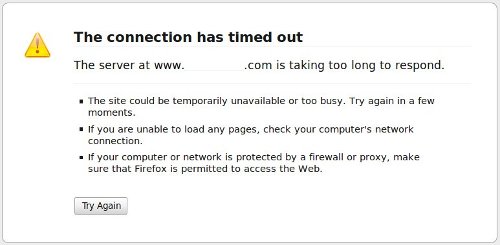
A perfect example:

Bad GoDaddy Hosting Service

I removed the domain name in this case – as you can tell.

The site has now been down for at least 15 minutes.  This has completely killed my ability to work on the site.

This is not the only time it has happened.  There have been multiple times – and sometimes cases that involved a lot of lost work from me.

Who is this hosting provider?  GoDaddy.  Unfortunately you get what you pay for when it comes to website hosting.  BsnTech Networks has mirrored website hosting.  Your site is always available because your site is on two servers in two different areas – reducing Internet and other issue impacts.  Sure, we are more expensive, but it is because we do not overload our servers with hundreds/thousands of websites – and you basically are getting two hosting plans.  Still even if you purchased two separate hosting plans with two separate providers, they could not mirror your site like BsnTech Networks can.

In addition to that, the GoDaddy FTP File Manager is limiting.  Do you want to make a full backup of your GoDaddy website?  Good luck.  If it is over 20 MB in size, the GoDaddy FTP File Manager will not let you make a zip file.

But, sometimes, you can’t use FTP either – because FTP is down!

GoDaddy FTP Is Down

What about trying to upload files using their FTP File Manager?  Well, I was attempting to upload a 7 MB zip file.  Well, it crashes the Adobe Flash plugin.  So, I had to resort to using FileZilla – an FTP client – to upload the file.

It is just disheartening to know that they do huge amounts of business and the level of service that GoDaddy provides for hosting is not great.

So, this is why BsnTech Networks charges more for web design when you have hosting elsewhere.  We have to ‘jump through hoops’ to work on your site and in cases, we lose work because of downtime.

How to Center A Website

The tip for today is how to center a website using CSS.  This is very problematic for many individuals new to doing web design.  Heck, I ran into a website that simply wouldn’t center when I was designing it today!

Why would you want to center the content on your website?  Well, for starters – how many people have large monitors or monitors with large screen resolutions?  Now, how many people still are running in 800 x 600 mode?  Quite a few.  So, those individuals that have high screen resolutions – you don’t want the content of your website to be static using margin CSS attributes.  You want it to “float” to the center all the time.  Unfortunately, there is not a “center” float in CSS (there is a left and right).  So you have to design your website to use other margin attributes so that it is always centered for anyone with any size screen resolution.

The first thing you need to do is declare some items in your CSS file.  Typically you will have a website that is setup with the following tags:

<html>
<head>
….
</head>
<body id=”site”>
<div id=”container”>
…… put your stuff here
</div>
</body>
</html>

So, in your CSS file, you want to have the main body of the website centered.  You can apply it to either “site” or to the “container” dividers as they are listed above.

A BIG note – No matter how much you try to use the below CSS attributes, they will not work unless you have this at the very top – or the very first line in your HTML document:

<!DOCTYPE html PUBLIC “-//W3C//DTD XHTML 1.0 Transitional//EN” “http://www.w3.org/TR/xhtml1/DTD/xhtml1-transitional.dtd”>

I ran into this problem today actually.  When I designed the website, I had the CSS below setup properly – but for the life of me, I couldn’t figure out why the content was not centered in the middle of the page.  The page was centered and looked perfect in Firefox, but it simply looked like crap and was all to the left in Internet Explorer.

Now, here is the CSS code that you’ll put in your stylesheet.  I am basing this off of using the “container” divider as indicated above; I’m not setting it using the “site” ID for the body tag.

margin-left: auto;
margin-right: auto;

You can also simply use this code as well, and it does the same thing:

margin: 0px auto;

So, two ways of doing it, but ensure that you add the line above at the top of your web page.

CSS Overflow Settings For Web Designers

I struggled a bit with the CSS Overflow a few times myself.

What is CSS Overflow?

CSS Overflow allows text, images, and other website design properties to “spill” out of the box that they were created in.

Why do you need overflow?

Well, the main reason I needed the overflow stylesheet attribute was when I made the menu on the main BsnTech Networks website.  When you hover over “Products” and “Blog”, the menu rolls out to the right to show the sub web pages under that category.

Originally, overflow was turned off in the divider to the right – where the menu was trying to “spill” over into.  So, when I rolled over the menu, it looked like nothing happened.  Well, I certainly cannot have that!

So I had to re-do the website design code in the stylesheet to turn overflow on.

The CSS overflow property can be set to one of the following:

visible
hidden
scroll
auto
inherit

The main ones I use are visible and hidden.  Sometimes, the ‘inherit’ property is used.  The ‘inherit’ property simply means that if you make a divider (<div>) within another, the one that is inside may need to be set to inherit – so it sets it’s overflow property as the first divider on the website.

OK, let’s see some examples now.

Let’s use the same code that I’ve used many times before that puts a blue background and a dotted border around this.  Here is the code in the CSS file:

#code{background-color:#9CB0D1;#DCDCDC;font-family:Courier;border:1px #000000;border-style:dotted;padding-left:10px;}

Good, now, there is no reason to have overflow in this case – because in this example, the box will automatically adjust to the site of the text.  That is because there is not a “height” or “width” CSS property in there. So, let’s change it to include a height property manually by doing this:

<div id=”code” style=”height:15px;”>

Alright, so the box above now has a height of 15 pixels – which we set by setting the style directly in the divider. No problems, right?  The text easily fits in the box.

Now, how about we use the same code – but set the text size to be larger:

<div id=”code” style=”height:15px;font-size:20pt;”>

OK – now we have an overflow problem! It is very easy to tell that it is getting cut off – and you also do not see the whole string.

So, let’s now set the overflow CSS property to “visible” so we can see the whole thing.  The below does not look pretty because we are overflowing the text out of the box – but in the case where you need it, it comes in handy (especially for menu roll over affects).

<div id=”code” style=”height:15px;font-size:20pt;”>

Yep, doesn’t look great, but it does the job. So when you are doing website design, this handy tip can help you figure out why it text or images appear to cut off when working with CSS.

How To Override CSS Styles For Web Designers

Overriding CSS styles is fairly straighforward.  That is today’s tip of the day for website designers.

In the previous post, I posted this bit of code that is taken directly from one of my CSS stylesheet files:

#code{background-color:#9CB0D1;#DCDCDC;font-family:Courier;border:1px #000000;border-style:dotted;padding-left:10px;}

As mentioned in the previous web design post, the CSS coding above is what is responsble for creating the box that encloses the above CSS style.  It is simply done by putting the above line in a divider that starts with <div id=”code”> and ends with </div>

So, if this style is already set – but you want to say – change the background color from #9CB0D1 to something else, how is that done?  Simple!  You can still call the main CSS style in the stylesheet file, but you then will specify an additional attribute in the divider markup so the website will display the changes you want.

For example – I want the line to be solid instead of dotted for the border around the section on the web page.  I would simply change my code to this:

<div id=”code” style=”border-style:solid;”>

See how doing that overrode the dotted line as the border?

Now, maybe I want to change the background color from #9CB0D1 AND also keep the border style as solid.  Well, here is how you do that:

<div id=”code” style=”background-color:#2EB0D1;border-style:solid;”>

Notice that you use the attribute – such as “background-color” and then it contains a colon (:) after it – then the actual setting for that attribute follows – which then has a semi-colon (;).  You can then plug in additional stylesheet attributes right after that in sequence – just like above.

So, that is how you can override stylesheet styles in order to do web design.  It is handy because there is no reason to make additional styles in the CSS file when you can simply override small settings like that.

The New Web Design Blog

Welcome everyone to the new Website Design blog.  I will be contributing some information about website design on this blog for everyone’s benefit.

At BsnTech Networks, we specialize in low-cost, affordable website design for personal users, businesses, and organizations.  So, it would only make sense to create a website design blog.

The first tip to pass on is the fact that CSS – or Cascading Style Sheets – is the wave of website design.  Gone are the days of manually hand-coding all of the styles, fonts, and colors directly into an HTML website.  When you use a CSS file, this is a file that contains styles for every item that you wish to have styles setup for.  In the websites, you will simply call the style sheet with a tag like this in your header:

<link href=”/css/css_file.css” rel=”stylesheet” type=”text/css” />

So, you’ll fill that css_file.css with all the styles you wish to use for your website.

Why use style sheets?  Well, the big reason is because every page of your website will then have the same “look and feel” to it when you do the website design for the pages.  No more different colored backgrounds, no more formatting mistakes and errors!

What does a CSS file have in it?  Here are some examples:

#code{background-color:#9CB0D1;font-family:Courier;border:1px #000000;border-style:dotted;padding-left:10px;}

So what does that say?  Well, it says that anywhere you have a <div id=”code”> tag in your website, the style that follows it in the {} brackets will be done.

The background color is the hex code of #9CB0D1, the font is Courirer, there will be a 1 pixel black border (designated by #000000 in hex code) that has a dotted style to it, and lastly – there will be 10 pixels of padding to the left.

Sound familiar?  Well, the “box” that the above code is contained in is the result of that line!  So instead of typing in that line throughout a page, you simply put in “<div id=”code”>” …. put your text here, and then close it with “</div>”.  So that way anything between those web design markup codes will have the specifications that you set forth in the CSS file.