 Rick contacted us a few weeks ago. He was looking for help figuring out his website accounts and also to find a “better way” to do things.
His original hosting provider deleted his Captain for Hire website since the invoice had went unpaid for a few days. Because of that provider’s policies, he wanted to move away from them.
Together, we reviewed the account and the products that were in it. We found a few items that he wasn’t using and set those to cancel.
In the process, he wanted us to re-create his Captain for Hire website, manage all of his domains for that site, and then we would move on to his next site.
After Rick was ready to get started, we worked with him to complete the domain transfers. We then were able to pull up a prior copy of his website to see what it looked like through the use of the archive.org resource.
Within a day, we had the website completed. Rick was supplied the login information so he could modify the site and he was pleased with the outcome and how quickly his situation was handled.
One thing he specifically mentioned is that it was nice to talk to someone with no accent – and the same person every time he called.
The website for Captain for Hire is at captainforhire.com.
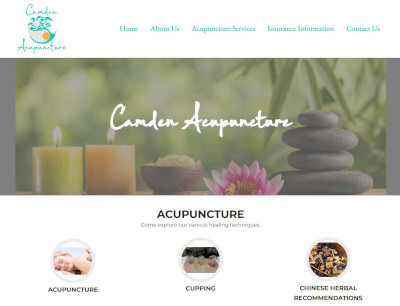 We previously wrote about a logo design being created for Maurianne, the owner of Camden Acupuncture.
 Maurianne, the owner of Camden Acupuncture, reached out to us at the end of February asking for some pricing on website and logo design services. She has been in the acupuncture business for quite some time, but moved her practice when their family relocated.
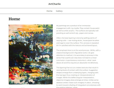 Charles, an abstract artist, reached out to us in mid-February asking about our website design services. We spoke over the phone and he re-iterated that he wanted a very simple and clean website to showcase his artwork. Earlier this year, we had a similar request for an artist that needed a website with several galleries to showcase his work. We provided Charles the link to that site – and that was what he was looking for.. but even simpler since Charles only needed one page to showcase his work.
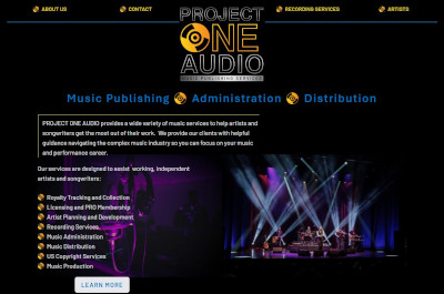 Tom, the owner of Project One Audio and Radio Storm Studios initially reached out to us in mid January looking for some help on his projects.
 Maria from Rayco RV Park contacted us a few days ago. We previously wrote about restoring their other website for Rayco Septic and modifying that site with additional changes.
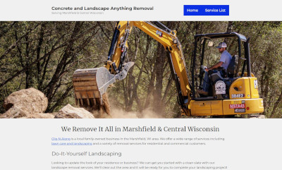 Steve, the owner of Clip N Along, contacted us in need of having a new website made. He already has two websites for other businesses – but wanted to have a website created specifically for different services he can provide with his excavator.
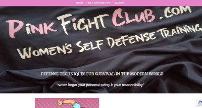 Rick, the owner of Pink Fight Club, reached out to us a few weeks ago about his trouble with the current provider he was using for website services. We previously posted of some of those difficulties with our last post when we completed his domain transfers and website rebuild for Captain For Hire.
 Rick contacted us a few weeks ago. He was looking for help figuring out his website accounts and also to find a “better way” to do things.
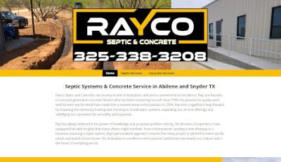 Maria from Rayco Septic & Concrete contacted us yesterday. They previously had us create a website for their septic business several years ago and she reached out to see about getting the website restored.
 Tom, the owner of Radio Storm Studios, reached out to us several weeks ago asking about our website design services. He was looking to get a couple of websites made. During those discussions, he also expressed a need to have a logo made for each business as well.